
Create an animated heatmap from a Google location data Takeout export
I love to go around by bike, and Berlin offers a good choice of paths to explore. However, after some year in the city I did realize there were areas I never visited and routes I did so often to become boring.
Out of curiosity I tried to process my own location history to map the places I visited more often and, to tell the routine commute habit apart, visualize the time of the day of a visit. The code is on github and of course it’s open source.
Get the data
Google offers an opt-in service, called Location History, that stores the position of a user over time. I find it immensely useful, for example to know how much time it takes me to commute or where I was on a given day, so I keep it on in spite of the obvious privacy concern. There are tools to do the same locally but the last time I checked the battery consumption was too high while the location service works passively. If you know of a better solutions, please leave a comment.
Google offers an export of a user data since before the GDPR made it mandatory, through the Takeout service. Choosing the location data we get a JSON containing a list of coordinates and timestamps. Additionally, it reports the accuracy and when available the type of vehicle and movement we were doing.
Process the data
The coordinates are in a notation called E7, which simply means WGS-84 decimal degrees multiplied by 10^7 and truncated to get two signed integers.
Since I’m interested in a specific area the script receives as a parameter the bounding box of this area
as 4 E7 values and the scaling factor as input parameters, and immediately instantiates a 2D numpy array representing the
heatmap to be generated.
Each value in this matrix represents a rectangle area in the world of size10^7 / scaling_factormeters.
A scaling factor of 1000 - 2000 is perfect for a city, 50000 covers a continent.
Going through the coordinates, the script simply calculates the cell in the matrix corresponding to a geographical position and increases the value of the cell of the amount of minutes spent in that position. The file doesn’t report the time spent explicitly, but the data points are ordered by time, so we can simply take the difference from a timestamp and the previous one.
This way we get a rough map showing how much time one spends in a specific place. The result, however, is not that great:
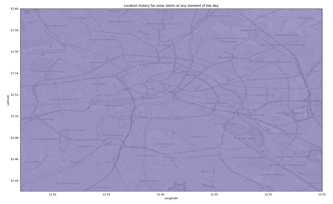
The heatmap we get by simply using as is the total time spent at each position.
It’s not very visible, but there are four dots on the map: the apartments and offices where I’ve lived and worked. Since the script is calculating the total time spent in each position, these very specific places trumps every other cell.
I tried different functions to normalize the values and make it nicer, for example take the N-root or apply a logarithm, and eventually the choice was quintiles:
# this can be done once
bins = np.linspace(1,100,100)
flattened = places.flatten()
quintiles = np.percentile(flattened[np.nonzero(flattened)], bins)

# for every frame
place_map_draw = (
    np.searchsorted(quintiles, place_map_blurred)
    / len(bins))
The initial steps calculate 100 thresholds to split the dataset in 100 parts of equal size, then every value on the matrix is replaced with its own quintile, the “rank” of the bin between 1 and 100.
Additionally, I applied Gaussian blurring
place_map_blurred = ndimage.filters.gaussian_filter(place_map, 1)
to reduce the artifacts due to the approximation of the coordinates and measurement errors.
The matrix can be displayed in many color maps, to choose one I just iterated over them:
cmaps = [
        'viridis', 'plasma', 'inferno', 'magma',
        'Greys', 'Purples', 'Blues', 'Greens', 'Oranges', 'Reds',
        'YlOrBr', 'YlOrRd', 'OrRd', 'PuRd', 'RdPu', 'BuPu',
        'GnBu', 'PuBu', 'YlGnBu', 'PuBuGn', 'BuGn', 'YlGn',

        'binary', 'gist_yarg', 'gist_gray', 'gray', 'bone', 'pink',
        'spring', 'summer', 'autumn', 'winter', 'cool', 'Wistia',
        'hot', 'afmhot', 'gist_heat', 'copper',
        'PiYG', 'PRGn', 'BrBG', 'PuOr', 'RdGy', 'RdBu',
        'RdYlBu', 'RdYlGn', 'Spectral', 'coolwarm', 'bwr', 'seismic',
        'Pastel1', 'Pastel2', 'Paired', 'Accent',
        'Dark2', 'Set1', 'Set2', 'Set3',
        'tab10', 'tab20', 'tab20b', 'tab20c',
        'flag', 'prism', 'ocean', 'gist_earth', 'terrain', 'gist_stern',
        'gnuplot', 'gnuplot2', 'CMRmap', 'cubehelix', 'brg', 'hsv',
        'gist_rainbow', 'rainbow', 'jet', 'nipy_spectral', 'gist_ncar']

for cmn in cmaps:
    plt.imshow(
        place_map_draw,
        cmap=plt.get_cmap(cmn), extent=[v/10000000 for v in [x0,x1,y0,y1]],
        origin='lower',
        )
    plt.savefig(f'locations_in_{selected_place}_{cmn}.png')
    plt.clf()
and seeing the results went with plt.cm.Spectral. Magma and Inferno are nice, too. De gustibus.
To generate the animated map, there is some logic tp filter the data being imported based on minutes after midnight:
if minutes_since_last_midnight_filter is not None:
    dt = datetime.fromtimestamp(int(loc['timestampMs'])/1000)
    sample_minutes = dt.hour * 60 + dt.minute
    if (sample_minutes < minutes_since_last_midnight_filter[0] or
            sample_minutes > minutes_since_last_midnight_filter[1]):
        skipped += 1
        continue
The animation is generated by iterating over a range of minutes after midnight and calculating a weighted average between the previous frame and the current one. This way, instead of “flashing” between frames the dots gradually vanish.
Static image
The end result, for the heatmap, looks like this:
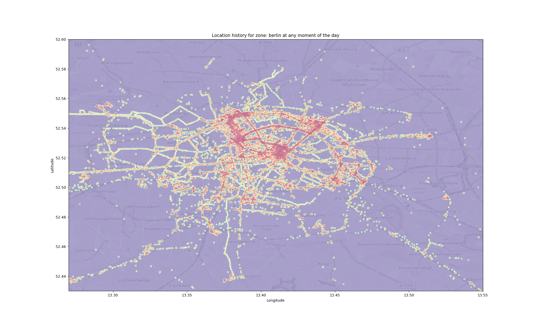
The heatmap after blurring and using quintiles to normalize.
For the background I simply took a screenshot from OpenStreetMap using the export tool to ensure the bounding box was exactly the same.
This passage is ugly necessary because while it is possible, using Plotly and Mapbox, to plot data on a map, it is not possible to export it to generate a video (if not by running a headless browser and taking a screenshot, forcing the user to install a big dependency) so I didn’t use it. Another option is to create a local tile server, which sounds fun but it’s excessive for such a simple script.
Video generation with MoviePy
While generating the GIF is trivial, producing a video has been quite complex. My first approach has been to use ffmpeg:
subprocess.run(f"ffmpeg -f image2 -r 5 -pattern_type glob -i 'locations_in_{selected_place}_time_*.png' '{selected_place}.avi'", shell=True, check=True)
this aggregates the frames previously stored on the disk as separate images and produces a video. Unfortunately, it takes several MB. I tried then to install and use the H.264 encoder but didn’t find any nice cross-platform mechanism to make it available to the user without installing too many dependencies.
I was about to give up when I found this delicious package called MoviePy. It provides a user-friendly Python library to perform video editing with some advanced effects, I suggest to give it a loog because it’s very cool and lightweight. The code is as simple as:
from moviepy.video.io.ImageSequenceClip import ImageSequenceClip
isc = ImageSequenceClip(filenames, fps=4)
isc.write_videofile(f'{place_name}.webm')
to generate a small webm file ready for publication on the web.
This is the result:
Enjoy!